Draper James Eyewear: Poppy Colors Meet Floral Spring Styling
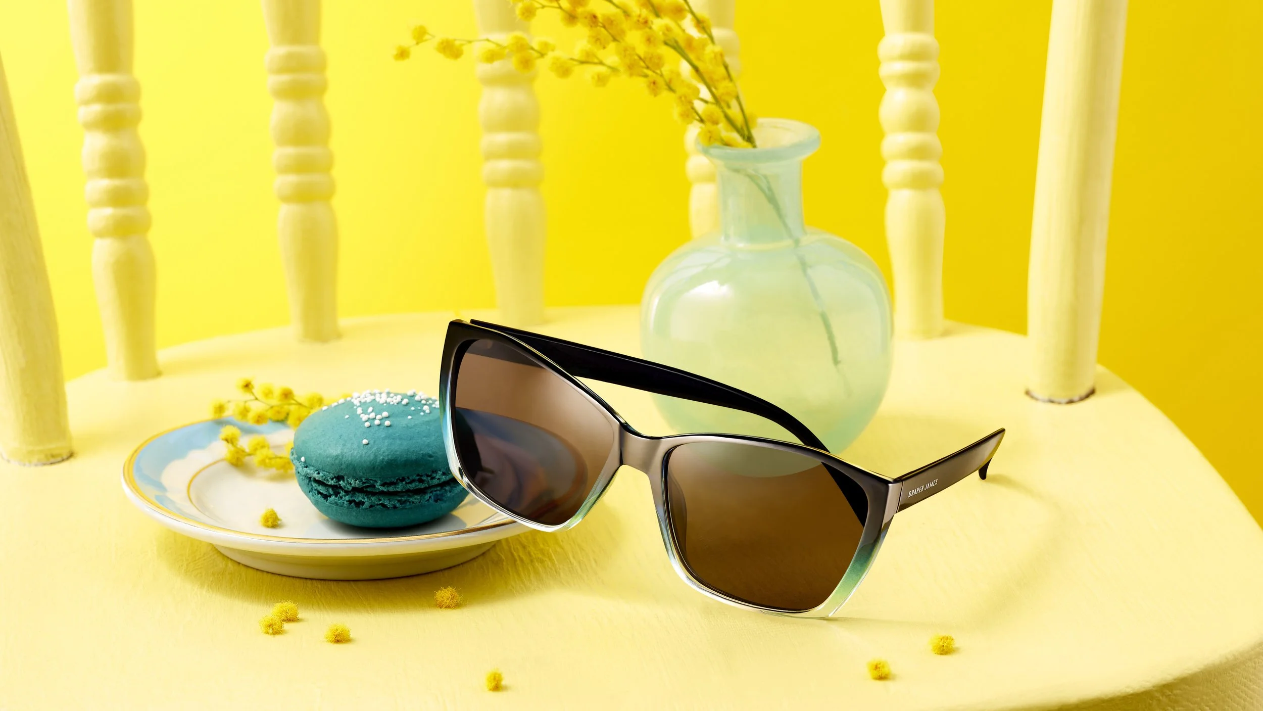
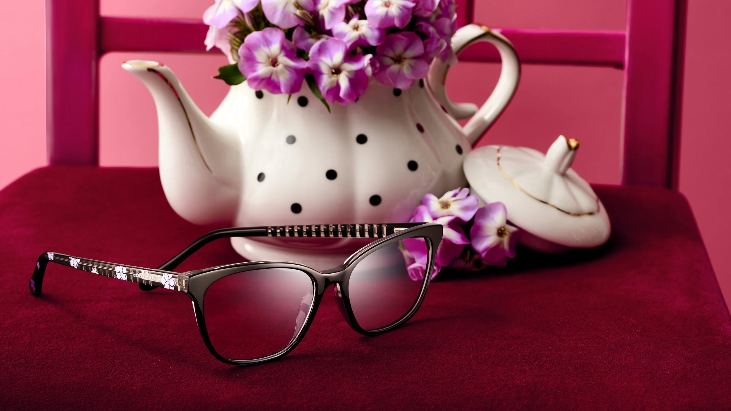
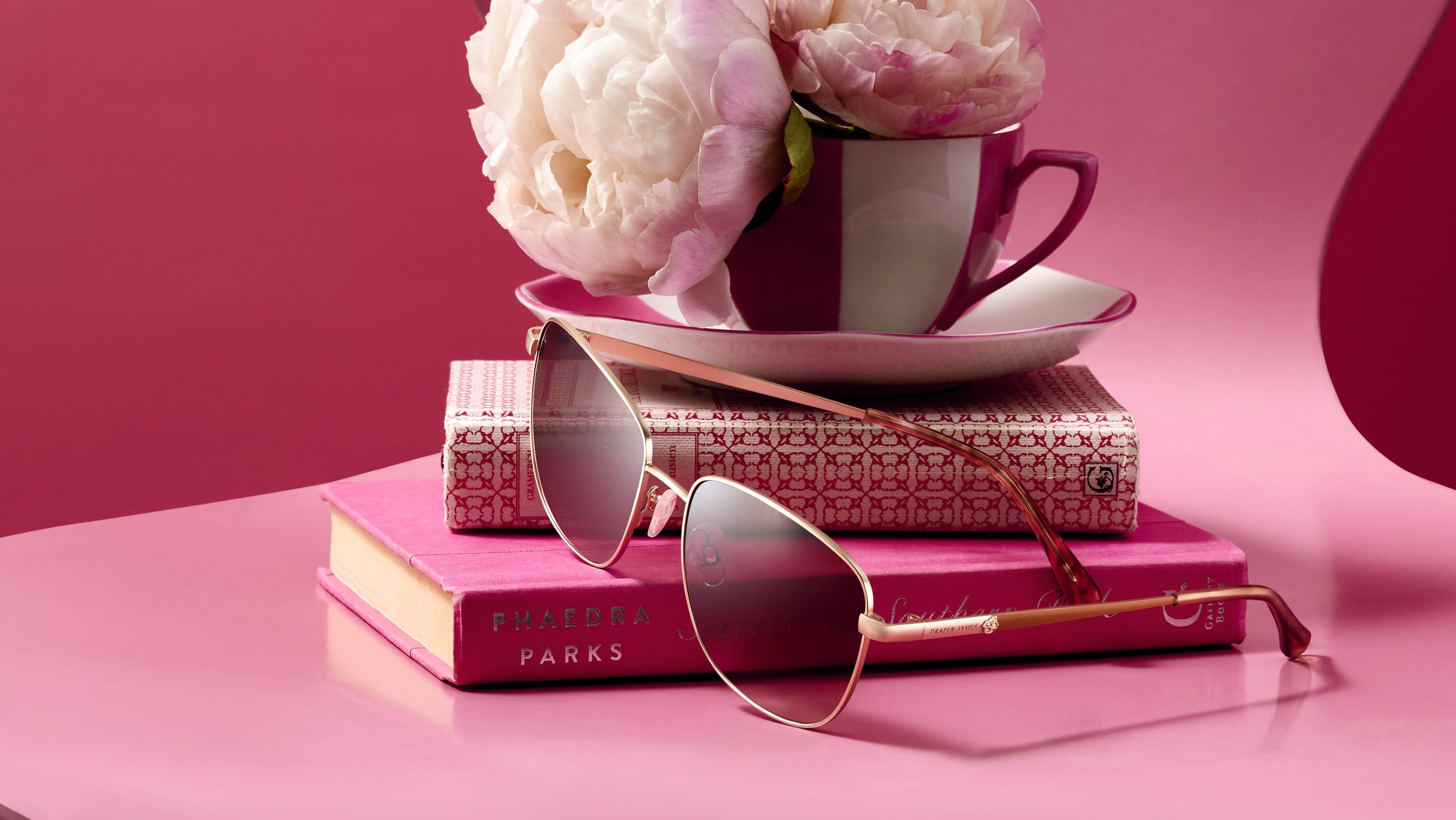
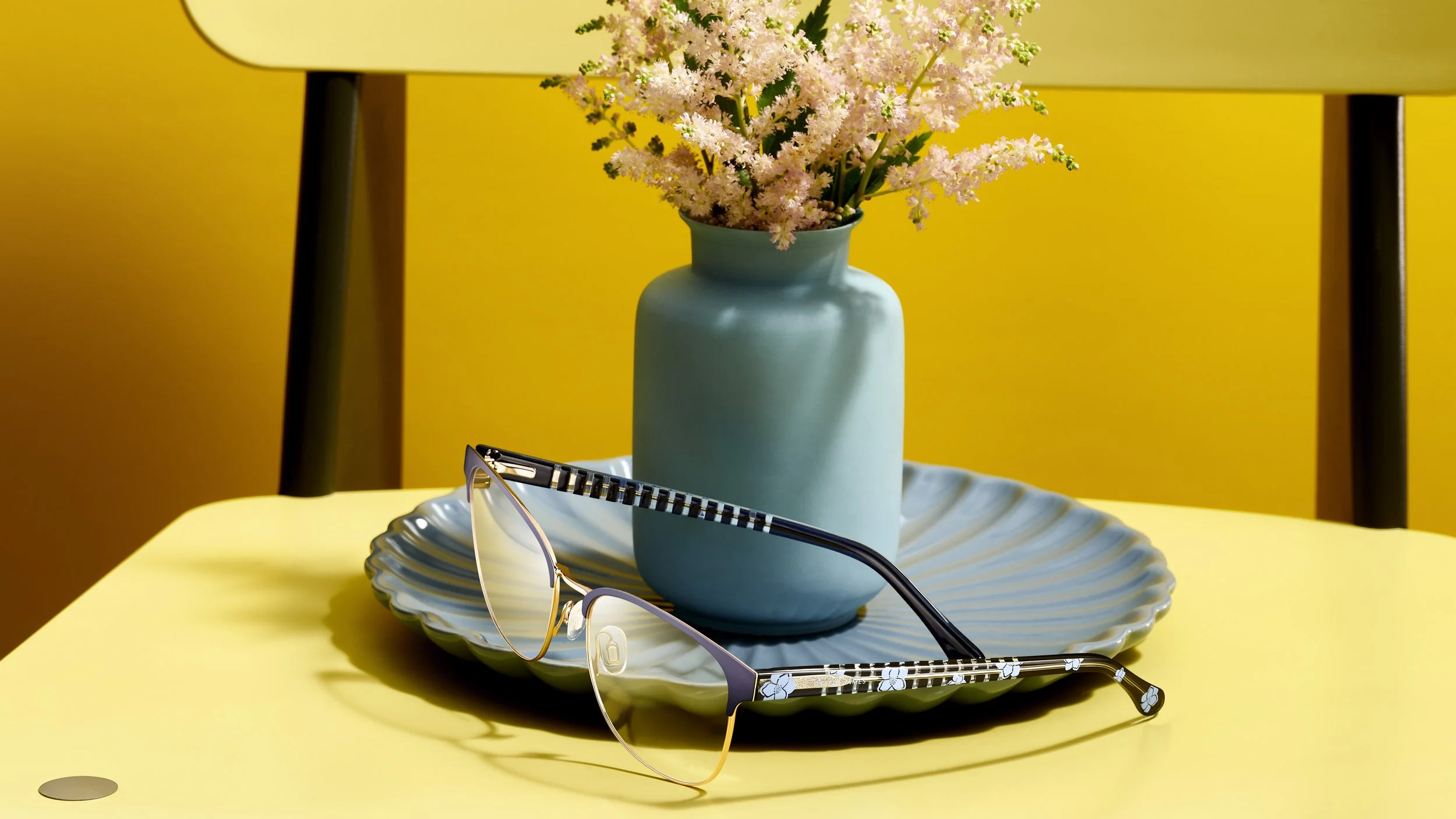
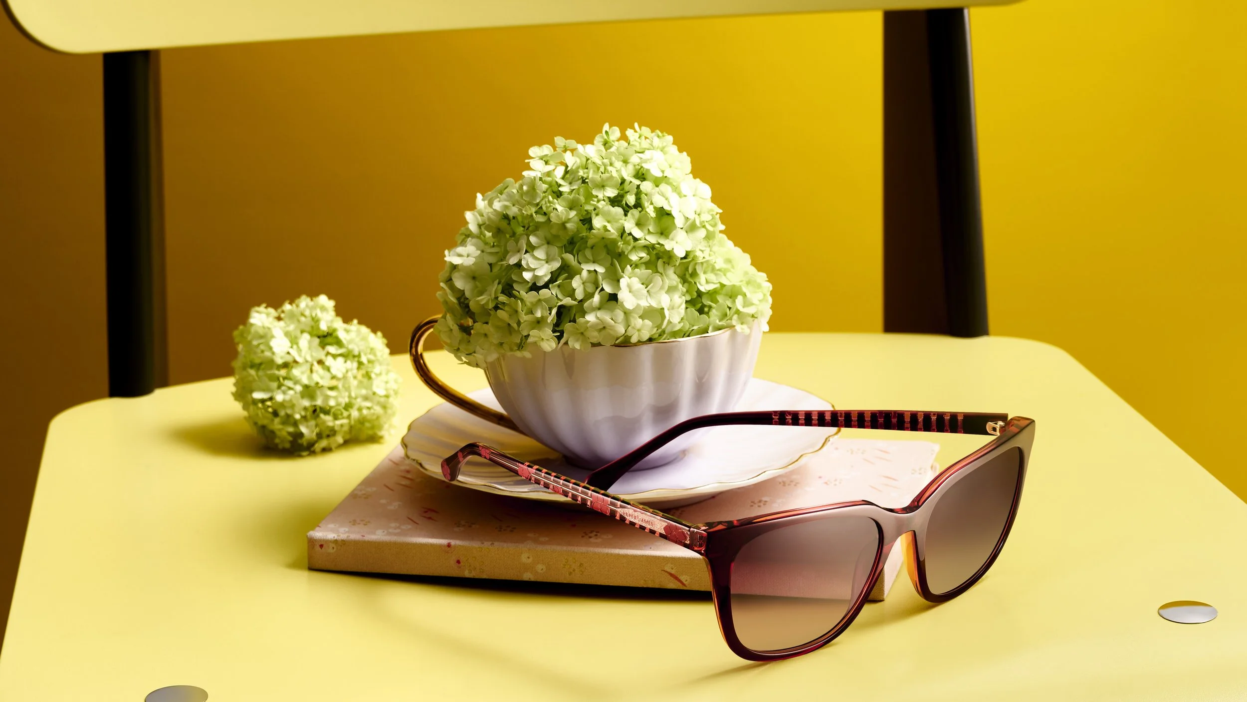
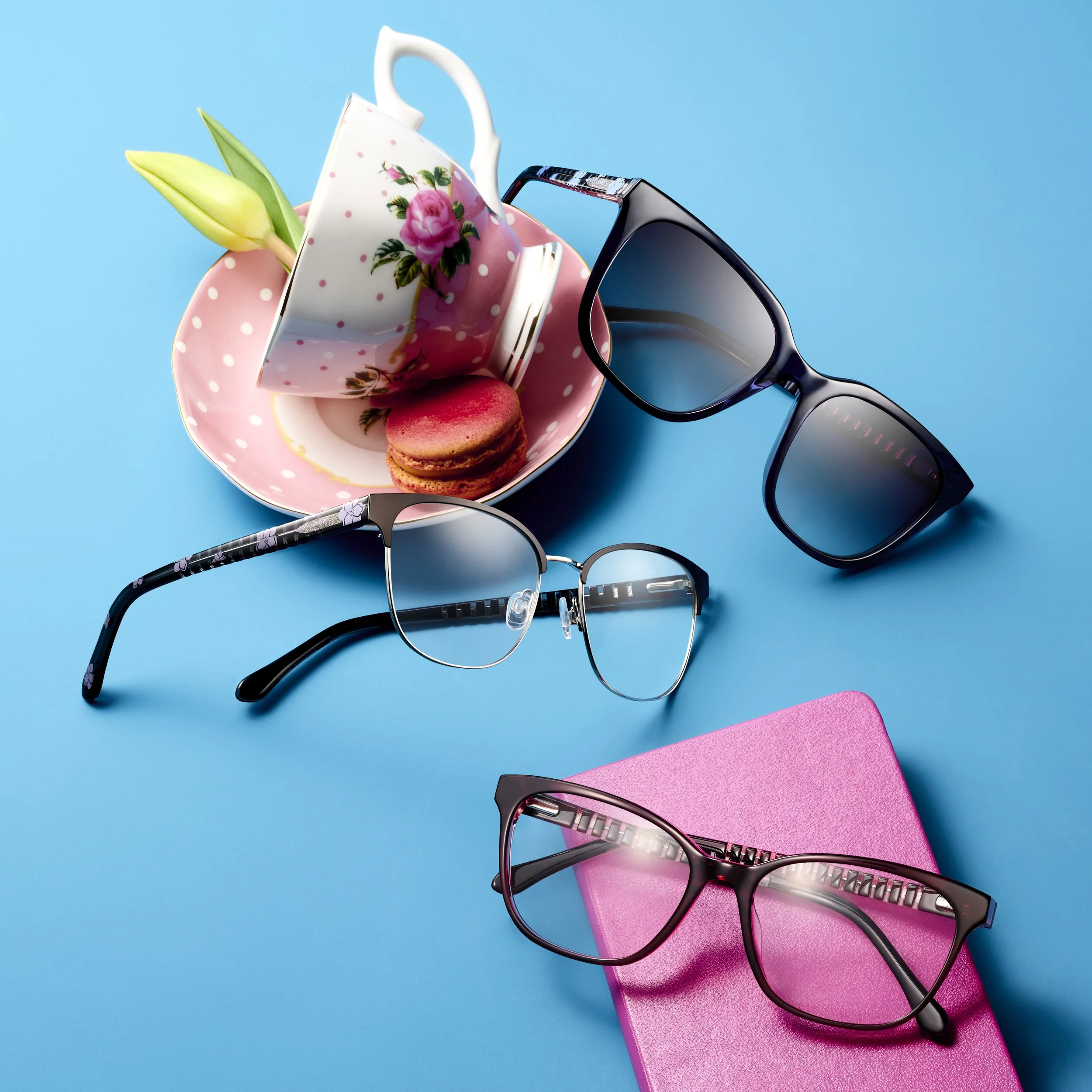
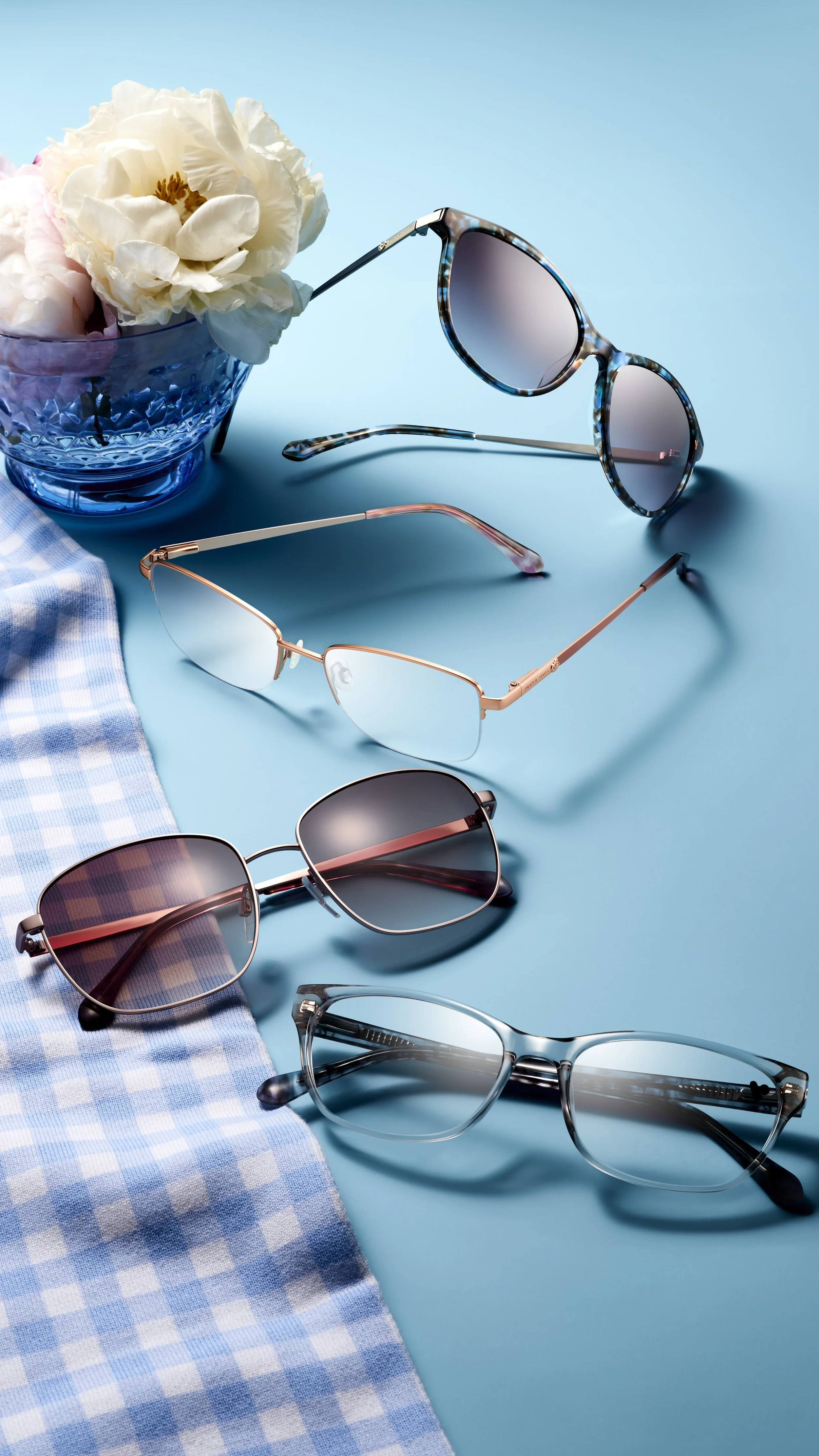
Spring is all about fresh energy, bold color, and thoughtful details—and our latest eyewear shoot captured all three. For this project with Draper James Eyewear, we leaned into a vibrant, poppy-inspired color palette paired with soft florals to create imagery that feels bright, optimistic, and effortlessly refined.
A Color Story That Feels Like Spring
The frames took center stage with saturated hues designed to stand out while still feeling timeless. By layering in florals and complementary tones, we built a visual rhythm that feels playful without overpowering the product. The result is a clean, elevated look that celebrates color while keeping the eyewear as the hero.
Styling With Purpose
Every prop and bloom was selected to enhance the frames—not distract from them. Florals added movement and texture, while negative space allowed the shapes, finishes, and details of each pair to shine. This balance is key when creating lifestyle-forward product imagery that still works across e-commerce, social, and marketing campaigns.
Designed for Versatility
These images were created with flexibility in mind—perfect for website features, seasonal campaigns, email marketing, and social storytelling. Bright, polished visuals help brands connect emotionally with customers while maintaining consistency across platforms.
Bringing Products to Life
At its core, this shoot was about capturing a feeling. Fresh, approachable, confident. The kind of imagery that invites viewers in and makes them imagine these frames as part of their everyday style.
If you’re looking to refresh your visual content with thoughtful styling and strong color stories, we’d love to collaborate.